A Energetic Brand Identity & High-Energy Social Ad We Created.
Brand Vision
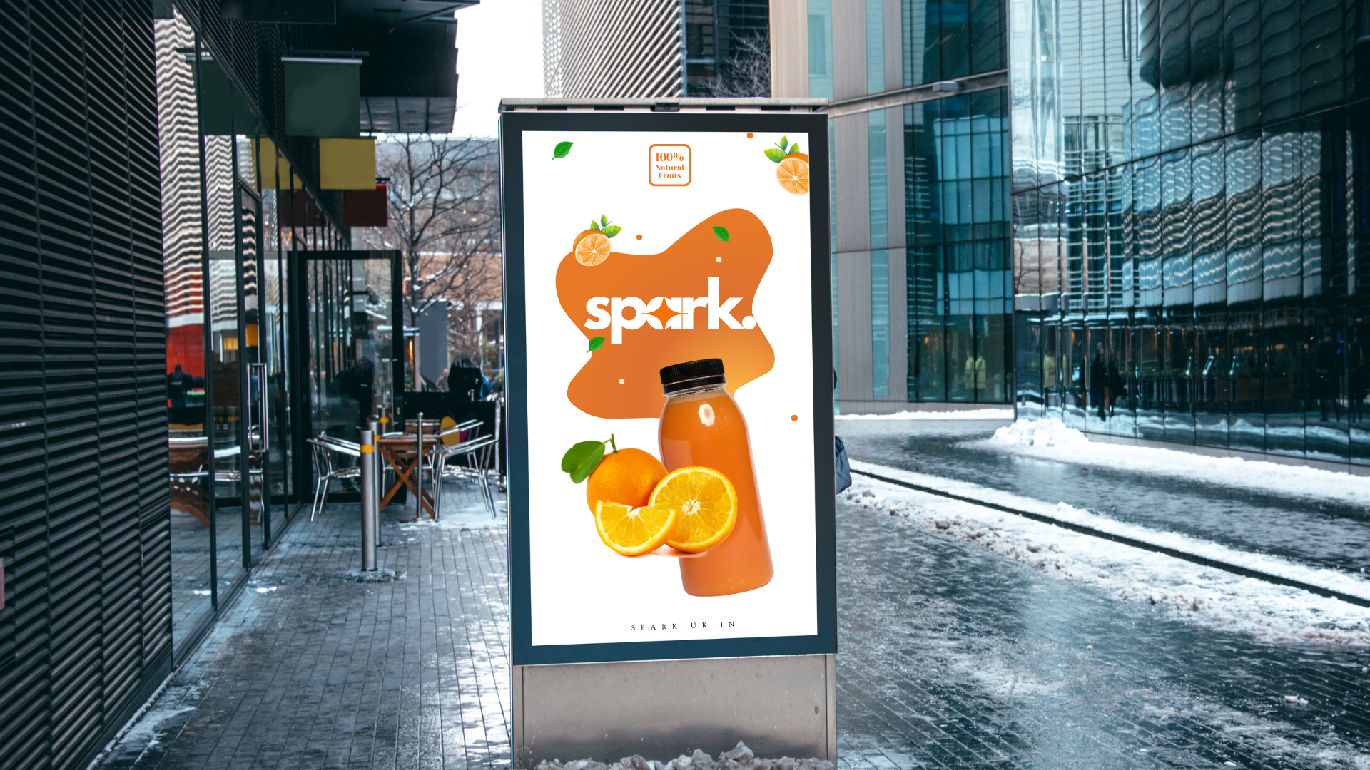
At Spark, they believe every sip should ignite energy. Their mission is to create a bold, lively brand that stands out in the world of soft drinks. With vibrant visuals and impactful social ads, Spark sparks moments of excitement and connection. They aim to energize their audience, offering more than just a drink—it's a refreshing experience that fuels the spirit.
Spark ignites energy with every sip, creating a bold brand that fuels excitement, connection, and refreshing experience beyond just a drink.
The Challenge
The challenge was to bring out an energetic identity that authentically represents the Spark brand. The colors needed to reflect the vibrant soul of their products, creating a visual connection with their lively and refreshing essence. The brand needed a strong identity that captured both excitement and authenticity while standing out in a competitive market.
The challenge was to create an identity that reflects Spark’s essence, capturing excitement and authenticity while standing out.
The Solution
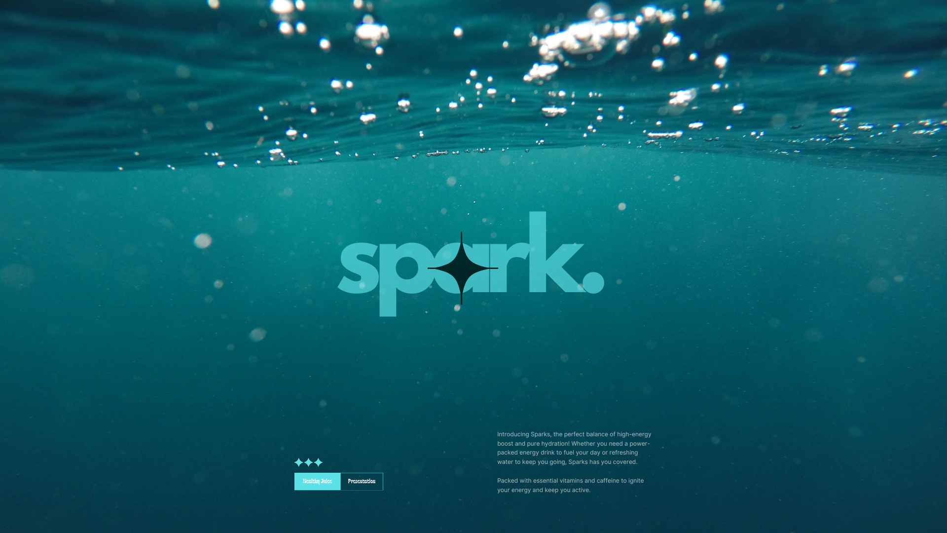
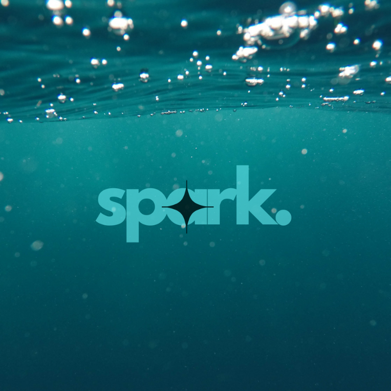
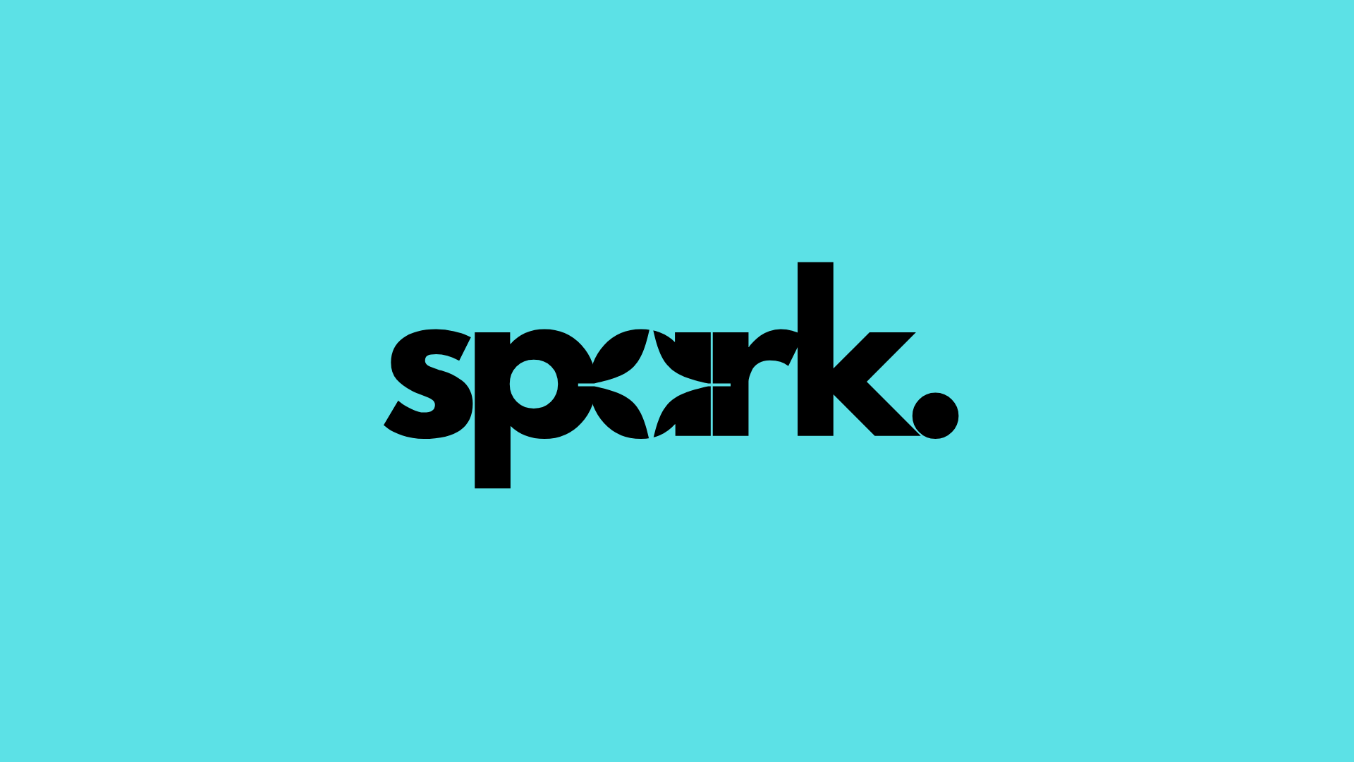
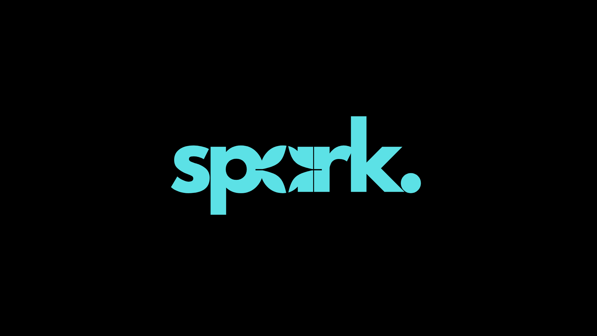
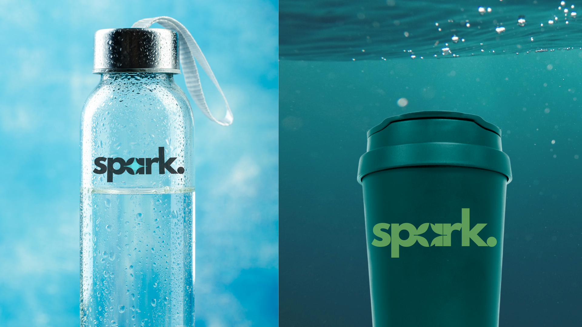
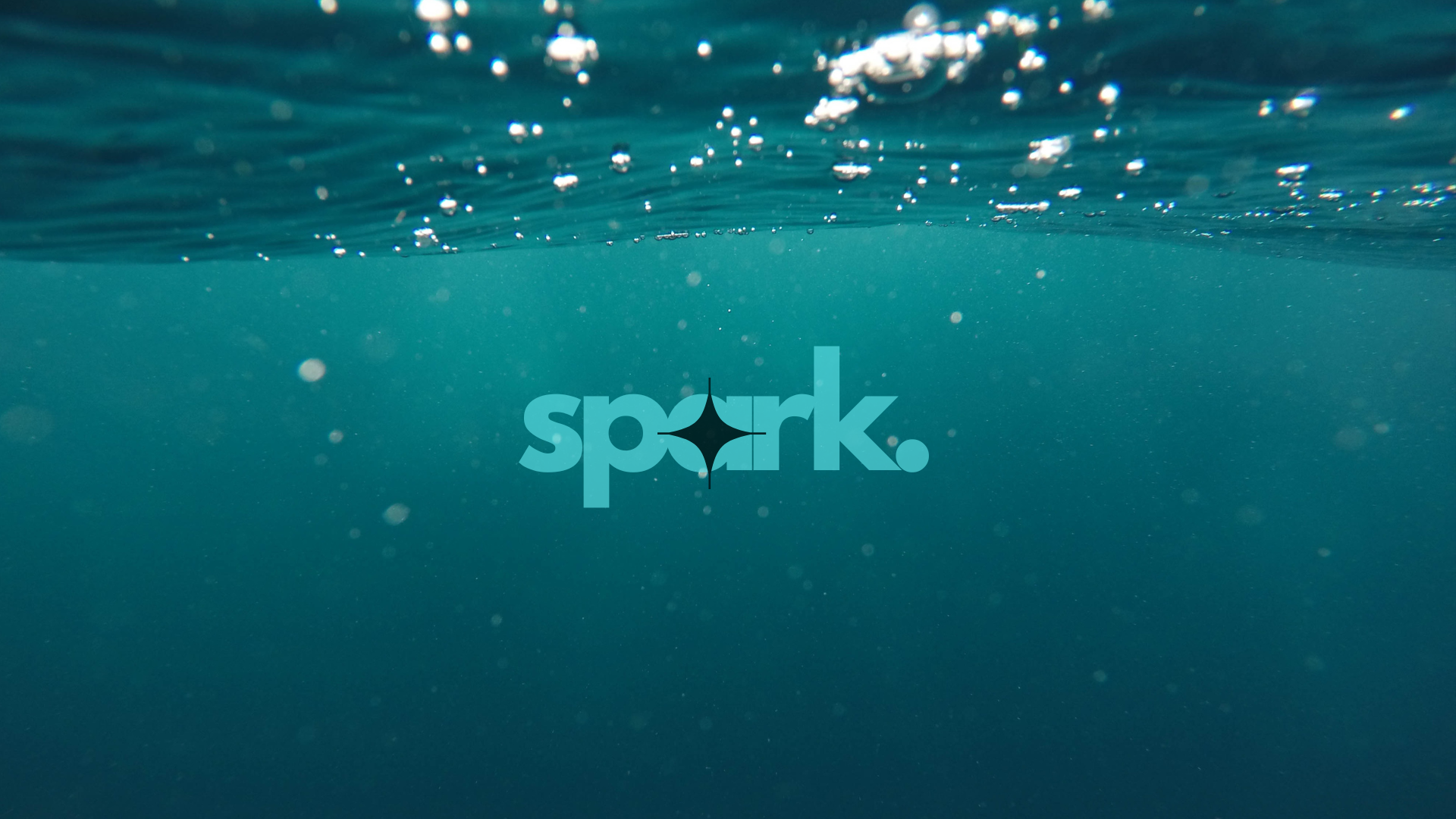
We designed a Wordmark logo for Spark, featuring a sparkle on the letter "A" and a dot at the end. The dot represents focus, symbolizing the brand’s aim to leave a lasting impression. The sparkle highlights the energetic and vibrant nature of Spark, while the colors reflect the refreshing essence of their products. This logo encapsulates the brand's bold and dynamic identity.
Spark’s Wordmark logo, with a sparkle on the "A" and a dot for focus, embodies its bold, energetic, and refreshing identity.
")
")