Created a brand identity for an overseas education consultancy.
Brand Vision
At Hepius Abroad, they aim to make studying abroad a seamless experience for Indian students. By managing the process from university selection to visa support, they ensure students focus on their education. Their guidance bridges the gap between students and global opportunities. Hepius Abroad empowers students to pursue their dreams abroad.
Hepius Abroad simplifies studying abroad for Indian students, guiding them from university selection to visa support, bridging the gap to global opportunities.
The Challenge
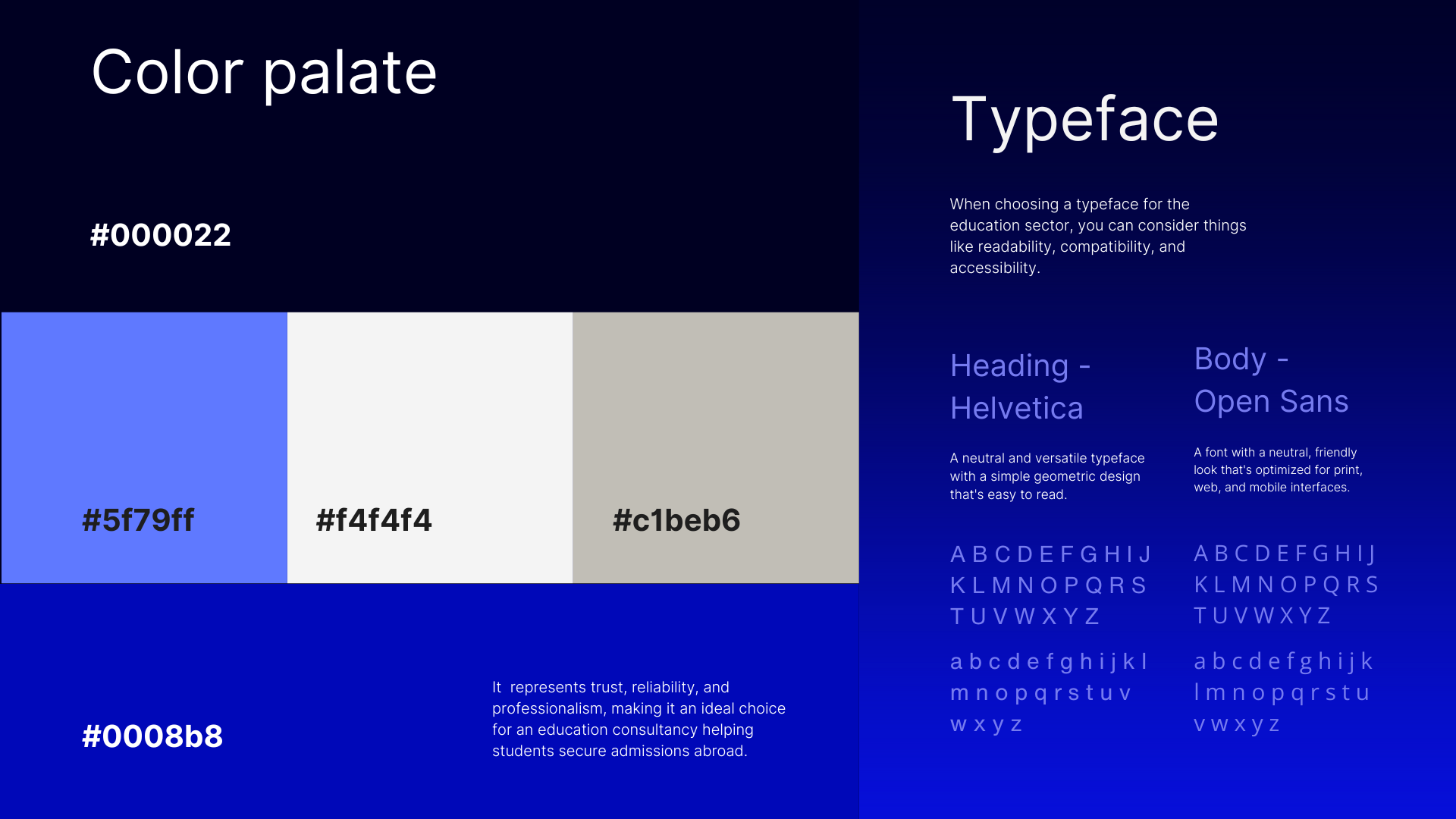
They needed a meaningful logo reflecting their vision of simplifying the study abroad journey. The challenge was to design a logo that conveys trust, guidance, and the seamless experience they provide. It had to represent the connection between students and global opportunities. The brand needed a symbol that resonated with students and parents.
The challenge was to create a meaningful logo that embodies trust, guidance, and a seamless study abroad journey, connecting students to global opportunities
The Solution
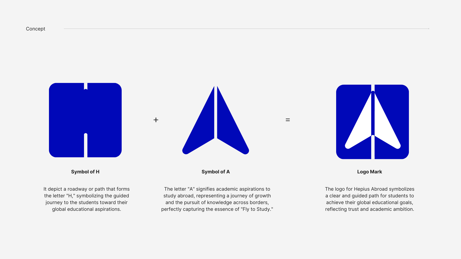
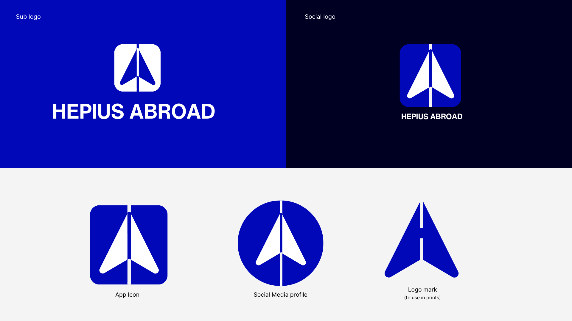
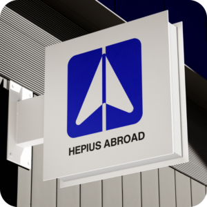
We designed the logo using "H" and "A" to represent Hepius Abroad. The "H" symbolizes a pathway or road, while the "A" is an upward arrow, signifying "fly to study." This concept visually captures the journey of students seeking global education. The logo reflects the brand's mission of guiding students toward Global Education.
We designed the logo using "H" as a pathway and "A" as an upward arrow, symbolizing the journey of students flying to study, aligning with Hepius Abroad’s mission.
")
")